The role of icons at HealthPartners
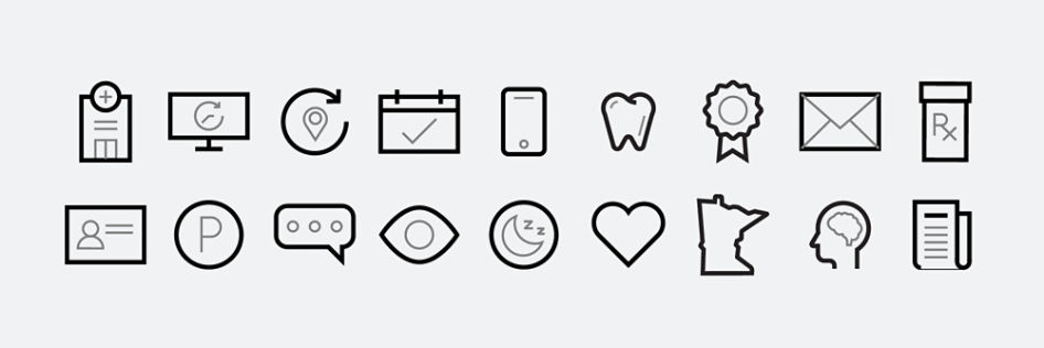
Our icons were specially designed and are unique to our organization. They’re used to communicate quickly across all touchpoints, as visual tools that make content easy to understand, rather than decoration. They’re not used as main visuals or simply to fill space. When used correctly, icons provide users with a familiar design system that’s simple, guiding and understandable.
We use icons to communicate specific information and actions. We don’t use icons randomly. Each icon has the same meaning every time it’s used. For example, there is a designated pharmacy icon, or urgent care icon, etc.
Icon styling and sizing
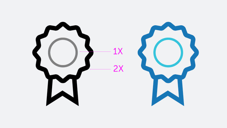
Our icons are made up of two line weights. The outside line weight (2X) is the thickest, while the inside line weight (1X) is thinner. When colorized, the thicker 2X line will have the darker hue.
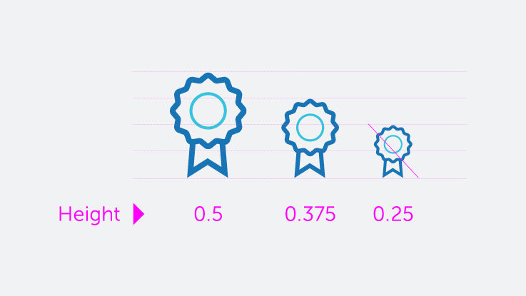
Never use smaller than 0.375 inches height.