We streamline our type by using bold and friendly fonts that are easy to read and easy to use.
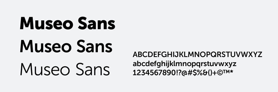
Museo Sans is a clean, contemporary font that’s friendly and highly readable. We use it for everything from headlines to body copy for consistent, recognizable messaging. Go to myfonts.com to purchase and download this font. A license is required for every computer on which it is installed. It’s used primarily in the weights shown below. See type setting section for more detailed direction.
When Museo Sans is not available, use the Microsoft default, Aptos. These instances include things like word processing applications (Microsoft Word), visual presentation programs (PowerPoint) and emails.
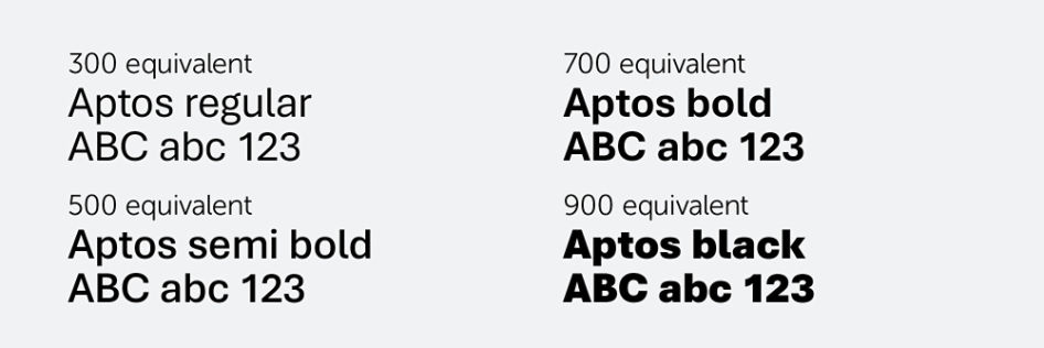
Alternate brand font
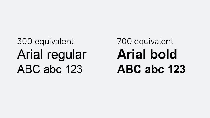
When Aptos is not available, use Arial.
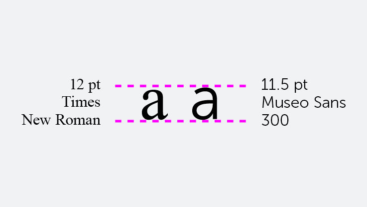
Medicare copy sizing
To be compliant with the Times New Roman 12-point standard set by Section 508 of the Rehabilitation Act for federal government business such as Medicare and Medicaid, copy in the Museo font cannot be smaller than 11.5 point.
Occasionally we need a few extra fonts in our toolbox. These fonts should be used sparingly.
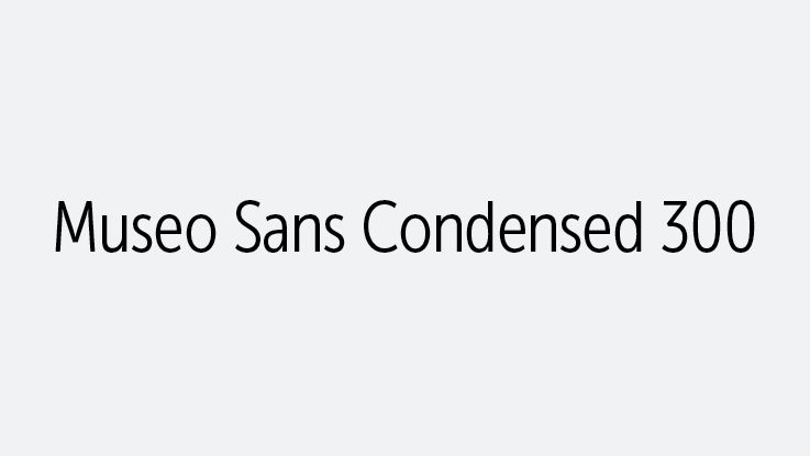
Museo Sans Condensed 300 can be used for legal or disclaimer copy, or when space is limited, such as within tables, or when a font is required to be a minimum size, such as in Medicare materials.
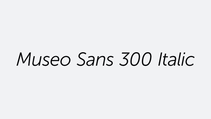
Museo Sans Italic 300 should only be used when referencing data points, books, movies, albums or publication titles.