Logos are to be treated with diligence and care. We don’t stretch them, condense them or otherwise alter them to compromise their integrity. When we share our logos outside of HealthPartners, we share the logo guidelines to help others comply with our brand standards.
Contact the HealthPartners Creative/Production teams with all logo-related approvals, requests and questions. Only those teams should make new logos or logo lockups.
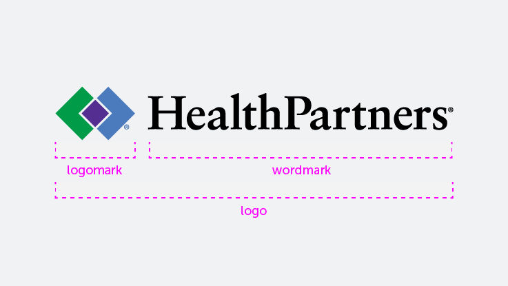
Our logo has two parts
Our logo has two primary parts: the logomark and the wordmark. The logomark always aligns with the top line of the wordmark.
Using the logomark alone
Using the logomark on its own is limited to internal materials and our own channels.
The logomark should have a ® (registered trademark) symbol next to it, except in a few limited applications.
Our logo has changed over the years, but one thing has remained the same: Our commitment to improving health and well-being in partnership with our members, patients and communities.
In 1937, a group of Minnesotans came together to help people pay hospital bills that were hard to afford. They created a prepaid health plan. But cooperative, prepaid medicine was illegal in Minnesota at the time, so they had to work hard to change the laws. In 1957, they did. They established Group Health, and they created a logo to represent all they offered.
In 1992, Group Health merged with MedCenters Health Plan. Together, they formed HealthPartners and created a new logo to represent their expanded reach.
Park Nicollet Health System had a logo of it own, which had been created after the 1983 merger of the St. Louis Park Medical Center and the Nicollet Clinic.
In 2014, after HealthPartners and Park Nicollet merged, a new logo was unveiled that considered both entities. The logo captured the triple aim of improving the health of the population we serve, the experience of each individual and the affordability of care. It was a symbol of partnership, of being better together and of putting the patient at the center of all we do. In 2017, the TM next to our logomark was updated to an ®.
In 2020, the “baby” HealthPartners under our logomark was removed, and the logomark was reduced in size to be in better proportion with the type. The result was a cleaner logo with more whitespace around it, which was easier to use on a range of print and digital materials.